|
|
Post by alexkerhead on May 28, 2008 1:39:18 GMT -5
|
|
|
|
Post by alexkerhead on May 29, 2008 16:55:06 GMT -5
Can anyone see the pictures?
|
|
PeterW
Lifetime Member
 Member has Passed
Posts: 3,804
|
Post by PeterW on May 29, 2008 18:34:29 GMT -5
Yes, Alex, the pictures appeared OK. Sorry I haven't made any comments on them, or some other pics recently, but I was a little busy taking the pics of folder shutter release linkages. I'll try to make up for it here.
I assume you want a critique rather than just a 'great shots' type of comment? Here's mine anyway, for what it's worth.
Pic 1. I like this one, I've always had a liking for pics of derelict buildings. They have a sort of 'past glories' air about them. I assume this is part of the downtown area that's being redeveloped?
Pic 2. Nicely taken, but sorry it doesn't have a great deal of interest for me as a picture.
Pic 3. I like this better, It holds my attention more because of the contrast (pictorially, not tonally) between the riverside area and the developed area of the Advertiser buildings, and the way the railway (sorry, railroad) tracks come in from the left to divide them.
Pic 4. Good diagonal composition, but I would have preferred less blank sky, and the pole further away from the centre of the pic.
Pic 5. Again, I assume this is part of the downtown area being redeveloped. It brings home a deserted feeling about what must once have been quite a busy junction.
Pic 6. I like this. I think I would have liked it a lot more if you could have got a lower viewpoint (maybe crouched down?) to get more foreground and less blank sky. As it is, the horizon almost divides the picture in half with nothing in the top half. What would have really made it is if you could have got a train coming in from the left to add interest to the area with the rather large clump of trees.
Pic 7. So many shades of grey here that it really calls out for colour. I've taken lots of pics like this in black and white, and always been a little disappointed that they weren't in colour.
Pic 8. I like this. Riverside scenes are another of my favourites. Critique? I think I would also have taken another pic from further over to the right, a little nearer the tracks, and again from a lower viewpoint, so that the tracks lead more into the picture. Once again I would like to have seen a train coming into the picture from the right, but in similar circumstances I've waited ages and ages for a train - and then, of course, one comes along just after I've taken the pic and started to move on.
Pic 9. I like the S-bend composition in this pic, but I'm a little puzzled as to what it is. Is it an overflow culvert to take away excess water and prevent flooding the banks when the river gets too high?
Pic 10. Nicely taken, and the 'Bus Lane' wording adds interest to what might otherwise have been an empty foreground. I would have liked to see a vehicle of some coming into the picture along the road from right to left to add to the feeling of movement given by the slightly diagonal composition.
Reading through what I've written it sounds as if I've been a bit harsh. I didn't intend to be, just one man's honest opinion of the pictures. Other people no doubt have other ideas.
I like the tone range you get with Kodak TX400. Do you develop the negs yourself? I think I've used TX400 only a couple of times, my favourite medium speed B&W film is Ilford HP5, mainly because I know it, and I know I can push develop it up to two stops in ID11 (or D76) if the light isn't too good. I often use a light to medium yellow filter with HP5. Have you tried one with TX400? I find it helps the contrast on dull days even though you lose a stop in film speed. The AE1's program will automatically take this filter factor into account.
Two questions: First, is the river the Alabama or have I got my geography up the Swanee again as usual? Second, are the skies always cloudless in Alabama, or was it just an overcast day? A few clouds could have made a lot of difference.
Oh yes, one more question: Why did you carry a 50mm lens when the 35-70 covers 50mm? Since I first got Canon's 35-70 short zoom it's been my most-used Canon lens. I can't remember the last time I had the standard lens on the camera, unless it was for some indoor shots when I needed the extra stop and half speed.
Keep shooting!
PeterW
|
|
|
|
Post by John Parry on May 29, 2008 18:59:44 GMT -5
Hi Alex,
Funny you should say that... First time I looked, all I could see was the image boxes (same with your avatar). I wasnn't logged in at the time so I didn't comment. Did you change something to make them appear? I didn't understand the "Edit for: Image fix." bit at the bottom?
I'll leave detailed critique to Peter, as this monitor isn't good enough to comment (I've been caught out by critical comments before, only to find that the pictures were perfectly fine when I saw them on a decent monitor). So I'll just take the "I like them" option !
I agree with Peter though - I can see why you might want the extra light from the 50mm prime in some circumstances, but you obviously had all the light in the world for these!
Regards - John
|
|
|
|
Post by alexkerhead on May 29, 2008 22:23:02 GMT -5
Thank you Peter, I really do need that kind of critique, because I am still very new to photography. Indeed, the derelict buildings are going to be built over or restored soon, that is why I wanted to catch them while I could. Thanks again for the critiques, Peter. I will definitely take the commentary with me when I go shooting next week. The water body is the Woodruff Lake, I live about 8 miles from the river.  It is a culvert(we call them ditches). It fills up with a good rain and empties into the Alabama river. After you and John mentioned it, it was silly for me to take the 50mm...haha I should have taken my 28mm lens. Oh well, next time I won't be so dumb.  I guess being a newbie at photography I thought the "bigger" front element would make photos better somehow...lol Peter, I don't know the first thing about film development, I let Walgreen's do my colors and I send the TX off through ritz. The prints were not as bright as the scans. I did them on my laptop, and didn't realize they were so bright until I viewed this site on my shop PC. I might need to darken them 5-20%. Again, thank you for the well thought out commentary, Peter. I enjoy reading nearly everything you write on TCC. We don't have photography classes near where I live, so I learn all the photo stuff I know from this site, and yours is a big part of it. I appreciate your time contributed. Hehe, thanks for the compliment John. Indeed, I fixed the links before, that was what the edit was for. |
|
PeterW
Lifetime Member
Member has Passed
Posts: 3,804
|
Post by PeterW on May 30, 2008 6:45:04 GMT -5
Alex, Glad to be of any help. I don't think you need to darken them, or you might get veiled highlights. They could possibly do with a shade more contrast for posting on screen. I took the liberty of copying one of the pics, adjusted the contrast just a little, cropped it a little to get rid of some of the blank sky and lift the horizon, and gave it about 30% Unsharp Mask. IMHO it suits a screen image better though maybe it just suits the settings on my monitor better. Hope it doesn't look overcooked on some monitors. What do you think? 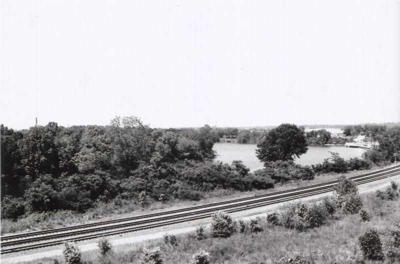 Original. 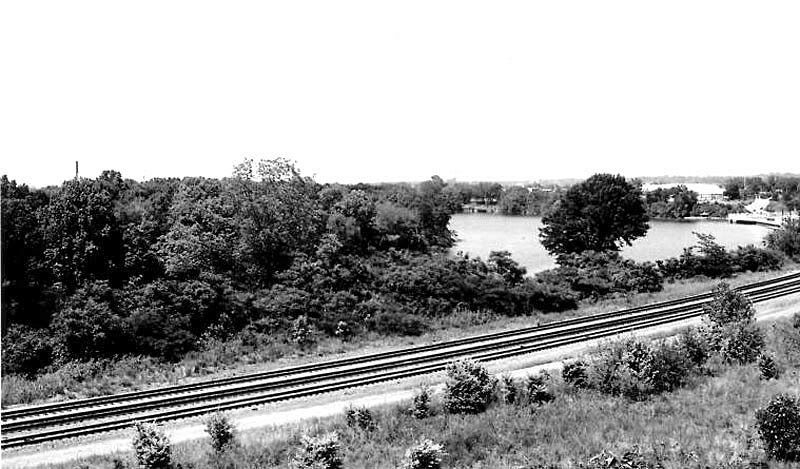 Slightly more contrast, cropped and about 30% Unsharp Mask. PeterW |
|
|
|
Post by alexkerhead on May 30, 2008 9:11:54 GMT -5
YES YES, that is what the prints look like(without the unsharp mask though)!.
The grays aren't running together like in some of mine.
Thanks Peter.
|
|


 It is a culvert(we call them ditches). It fills up with a good rain and empties into the Alabama river.