PeterW
Lifetime Member
   Member has Passed
Posts: 3,804
|
Post by PeterW on Dec 31, 2005 12:45:16 GMT -5
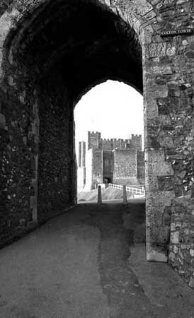
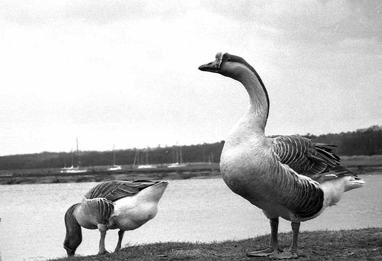
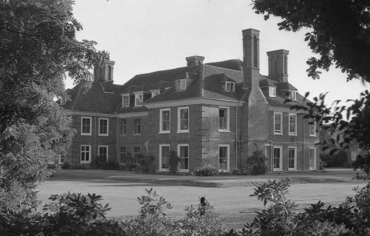
Hi all, Here are three black and white pictures on which I would apppreciate your critiques. They were all taken with my trusty Canon A1 loaded with FP4 Plus and developed in the last of my stock of ID11. Hope you enjoy them. Peter  I wanted to get something different from the usual picture of Dover Castle so I went back behind this gateway and shot through it. I wanted a good depth of field so I stopped well down and focused on the concrete posts at the far end of the gateway using Canon's 35-70 short zoom set at 35mm.  A watcful mother. This pair came up out of the water quite close to me, but so as not to disturb them I drew back a way and changed to a 200mm lens. This was actually the third picture of them I took, and the only one in which the mother bird raised her head clear of the background. Though the mother bird seemed unconcerned at the camera clack she still kept a very watchful eye on things.  I walked round the grounds of this stately home in Hampshire for ages trying to find a good viewpoint. In the end I climbed over a little fence into a lane and took it using a 28mm lens to get the trees framing it. I wish there had been a few people in the grounds at the time, but you can't have everything! |
|
|
|
Post by John Parry on Dec 31, 2005 16:22:52 GMT -5
Hi Peter,
Using the argument that I put forward earlier that I shouldn't say anything if I've nothing to say (!) then I shouldn't say anything about the second and third shots - to me they are practically perfect, and everything about them is right, with the single comment that in the second one, as you couldn't get enough depth of field to bring the background yachts into focus, maybe you could have decreased the DOF and taken them out of focus altogether. Easy to say when I'm not trying to get two wild geese to pose in perfect positions (as you've got them here).
The first one has me scratching my head. For some reason I find myself saying Mmmmmmmm..... as opposed to Yes.....
It has everything that I like in a shot - especially the double arch overhead, and the perfect frame that the gateway forms. Is it as simple as the aspect ratio being elongated I wonder?
I'm going to chicken out here, and wait to see what everybody else has to say!
Regards - John
|
|
|
|
Post by Randy on Dec 31, 2005 17:37:00 GMT -5
Peter, those pictures are wonderful. I'm humbled and hope that some day I too can produce photos like that.
|
|
|
|
Post by luke on Dec 31, 2005 17:40:03 GMT -5
Peter, thanks for the shots. Number one in my view could be improved by cropping less severely on the left side of the arch. I feel there's something missing there. The turrets in the far distance are a little soft but overall it is an enchanting shot. Number two - great timing to catch mama goose with her head up. I agree on the DOF comment John made.
Number three is a really great shot with a lovely range of greys. The framing is great and I think the absence of people only adds to the mystique making the building appear timeless.
Luke
|
|
|
|
Post by kamera on Dec 31, 2005 18:15:54 GMT -5
Peter,
The first is by far my favorite. I really like pictures within pictures...ie., framing such as you have here. At first, my eyes did not get beyond the arch. I was drawn to the various shading and gemetric patterns of the stones. But eventually my eyes worked their way to the castle, which could almost be a mural in the background and not the real thing. Then coming backwards again, I noted the pathlike marking on the ground which leads the eye right to the posts focused on. Neat. But what is the different colored marking...a different cement, water mark, etc.?
Ah...goosies, goosies. I know very well how hard they can be to photograph. They have a mind of their own(I swear) and refuse to cooperate. However, take your eye from the viewfinder...and...hey, why didn't you pose like that a minute ago...LOL. Mother Goose appears almost like a statue...prim and proper...and yes...keeping a sharp eye out for the mischievous Mr. Wallage there! The scene brings back to me, though, what was at the time frustration, but now laughter when I recall it. I was standing on a slight grade of grassed ground looking out toward the water when I heard a nasty honk right behind me. I turned, slipped in the grass, caught my camera from hitting the ground but my right hand fell right into...well...that messy stuff geese drop all over the place...and to top it all off...this goose beak about 6 inches from my face.
I have a couple neat pics of swans that I took a few years ago. Should look them up and post.
The stately home is framed on three sides by trees/shrubs and this really adds to the scene as does the various shadows on the ground and building. The shot looks like a pro one that you might see in a magazine showing 'the homes of celebrities'. This pic would look neat in color, framed and displayed either as is or converted to a 'painting' in Photoshop.
For being tied up at home with different forums, your cameras, etc., when you do get out, you produce!!!
Ron Head
Kalamazoo, MI
|
|
|
|
Post by John Parry on Jan 1, 2006 7:35:15 GMT -5
Peter,
Been thinking about these again. You haven't slipped us a googly here have you?
I mean, they are all yours? They have something of our ghostly lady photographer
about them maybe? If not I apologise, and acknowledge that you share a masterly
technique.
Regards - John
ps It was that one of the church door that got me thinking.....
|
|
PeterW
Lifetime Member
   Member has Passed
Posts: 3,804
|
Post by PeterW on Jan 1, 2006 11:32:22 GMT -5
No, John, these are all genuine right arm over the wicket straight balls. Orl me own werk, Guv, honest! Yes, I can see a certain similarity in the stonework, and maybe something was vaguely connecting in my mind, but then using a similar technique to one you have admired is a sincere form of flattery! With regard to all the comments, all I can say is Thanks, Guys. Gosh! I didn't think I was THAT good!  Yes, Luke, there is someting missing on the left of the picture of the archway, a noticeboard giving the times that the castle is open to visitors. I debated with myself before taking it out, but it wasn't a particularly well made noticeboard and really didn't fit in with the atmosphere I wanted. OK, if I'd wanted to be really cunning I could have tried to take it out with Photoshop, but I decided to crop instead. Ron, the dark run of asphalt leading through the arch was a resurface of some sort, possibly where electricians had laid cables for the castle floodlighting. With regard to the background in the shot of the two geese, I thought at the time I was using a large enough aperture to throw it much more out of focus, but obviously not. Thanks again for your comments. Peter |
|
|
|
Post by herron on Jan 3, 2006 11:42:26 GMT -5
Peter: I like all the shots. I do agree with John about the DOF in the geese...would have made it nearly perfect...and the shot of the home in Hampshire IS perfect...nicely done. As to the archway shot, I would have liked to see either all of the first arch, to complement the silohette of the second arch -- or none of it, to force your attention squarely on the tower beyond. Still, I would have been proud to claim any of them. So should you!  |
|
PeterW
Lifetime Member
   Member has Passed
Posts: 3,804
|
Post by PeterW on Jan 3, 2006 12:23:32 GMT -5
Thanks Ron, and everyone else.
I do agree about the DOF with the geese but, as I said, I had the 200mm lens only about two stops down from its maximum f/2.8. Even then I was shooting at a fairly slow shutter speed, about 1/60 sec, because the light was so dull and flat, not a good modelling light, and I wanted to get detail in the birds' feathers and down. Also, with a long lens I was a bit apprehensive about camera shake if I went slower, and getting enough DOF if I opened up more.
With Dover castle I think maybe I tried to get too much in the one picture. However, we go there fairly often as my four year old Grandson loves the place. He loves the winding stone staircases, the rooms each opening into another room and the artifacts like armour and swords they have on display.
Next time I want to take him to see the underground wartime command rooms deep inside the rock. That'll be quite a test of technique because of the low-level tungsten lighting. I think I'll take two cameras, one with black and white and one with colour print.
I might also have another go at the archway picture. I just know there's a better shot there somewhere.
I've really appreciated the critiques. Constructive comments like this are how we all learn, and with photography we never stop learning, no matter how long we've been taking pictures.
Peter
|
|
|
|
Post by kamera on Jan 4, 2006 12:25:59 GMT -5
Was just taking in these pics and reading responses again.
No...I have not changed my mind...#1 is still my favorite. But I was restudying it based on Luke's comment about the left side of the arch.
For me...I would leave as is, or add only a fraction more on the left side. The way it is keeps MY eyes from wandering off to the left too far and the straight left wall leads me right onto the posts and background. The entire right side...arch, short wall...and the right-to-left angle of the repatched walkway all go hand and hand IMHO.
Ron Head
Kalamazoo, MI
|
|
mickeyobe
Lifetime Member
   Resident President
Posts: 7,280
|
Post by mickeyobe on Jan 4, 2006 13:12:58 GMT -5
Peter,
I like all three pictures.
I like the boats in the picture of the geese. It tells the viewer where they and we are without being too obtrusive.
The picture of Dover castle is exceptional. Symmetrical pictures are all well and good and easy but assymetrical ones are more powerful. It is interesting how the line extending from the base of the gateway on the left zigs slightly upwards to the gateway wall on the right and then zags upward directly to the castle entrance. I am glad you did not include the top of the arch (keystone?) as that would have been too distracting.
That stately home is considerably bigger than what we have here in the colonies. I do feel sorry for the man of the house having to wash all those windows every spring and fall. I'll wager he would be very pleased if you presented him with your portrait of his home.
Mickey
|
|
PeterW
Lifetime Member
   Member has Passed
Posts: 3,804
|
Post by PeterW on Jan 4, 2006 14:44:31 GMT -5
Thanks again, all. My! I've never had so much useful critique.
Mickey, I think the stately home now belongs either to the National Trust or to English Heritage. I suspect to English Heritage because I belong to that and my card gets me into any of their properties or sites for nothing, but this was taken earlier last year and I can't remember which home this was.
Many of these homes were sold by old once-monied families to pay crippling death duties, and it's good that most have been bought by organisations like NT and EH, supported by subscriptions and public money and grants from the National Lottery, rather than fall into the hands of theme park operators.
Some, of course, are still with the original families who have turned them into tourist attractions, except for their private quarters, usually by setting up a private trust. An example is Beaulieu House and the Beaulieu motor museum - now the National Motor Museum.
When this one was in the hands of a family I doubt very much if the head of the household ever did anything so demeaning as cleaning windows. They would have had an army of servants to do that sort of thing. I would also hate to rub down and repaint all those window frames every couple of years, let alone mow the lawns. It would be a never-ending job!
Peter
|
|
|
|
Post by litesong on Jan 20, 2006 19:58:50 GMT -5
Hi Peter...I truly admire people who can handle black & white. I can't. Better my camera drop & if the shutter goes off, that would be my best picture. The geese are lit austerely with a camera position to show the heroic mama. I find it hard to believe you shot with a 200mm, because the picture gives the impression of immediate & close 3 dimensional presence, to which task wider angle lenses perform better. Your brighter sky has been subdued to present mama well. Your lens has controlled flare so it is not overwhelming.
In your home photo, lighting softly details the genteel home at its best. Yet crisp sharpness shows the brick without adding hardness. Your lighting complements your foreground foliage, yet you haven't placed so much foliage as to make the viewer want to move a branch to see more of the house.
Ach...but the first picture...prepare yourself! First, you have failed to show proper knowledge or present respect to one of the "corner stones" of Roman engineering by not only slashing the Roman Arch once (left side), but twice(upper side). The initial viewing impression is that the archway should collapse as structurally incomplete. Second, you haven't given proper acknowledgment to the lovely engineering & workmanship of the outward arch. By failing to show the whole arch, you demote it to an accessory only. But look at the parts you did show...lovely. My eye struggles to see the whole arch in all its beauty beyond the bounds of the frame. Third, your failure to see the loveliness of the lighting caressing the arch stops any reason I would have for delighting in the your presentation of the castle. You have controlled black & white to your beck & call. But in this picture, talented skills have not led to the proper presentation of art.
Your talent unveils art in two pictures. You hide art in the third....litesong
|
|
PeterW
Lifetime Member
   Member has Passed
Posts: 3,804
|
Post by PeterW on Jan 20, 2006 21:19:46 GMT -5
Many thanks, litesong, for your carefully considered critique and praise. I grew up and learned my photography with black and white, and had to readjust my technique when I changed to mainly colour. It's very different. I still like using black and white on occasions and still often find myself thinking in black and white terms when I look through a viewfinder.
With a 200mm lens I find that if you have a subject with only a short plane of focus, and plenty of distance behind it, it avoids the usual foreshortened perspective look you get with many long focus lens shots. I suppose it's a matter of using the depth of field, something to which, I must admit, I don't always give the consideration I should. In the picture of the geese my main reason for moving back and using a 200mm was so as not to disturb them. The perspective effect was more luck than judgement!
My picture of Dover Castle has caused a lot of comment about the viewpoint and the somewhat severe cropping. As I said, I wanted to take a picture of the castle that was different from the usual 'tourist' or 'brochure' picture of it. I do appreciate the beauty of Roman and Roman inspired medaeval architecture but in this case I agree I used the archway as an accessory, a prop if you like, to frame the curving path up to the castle and the castle itself. Sorry about cutting out the keystone and other features of the arch.
One day, when I'm at the right location, I'll look more at using the stonework with its architecture and texture as the focal point of a picture. And I'll have two cameras with me, one with colour and the other with black and white to see how they compare.
Thanks again. As I said before it's only with considered critiques like this from another photographer that we can learn. They mean more to me than a 'that's a nice picture' comment, sincere though it undoubtedly is.
|
|