|
|
Post by John Parry on Jun 5, 2006 13:24:14 GMT -5
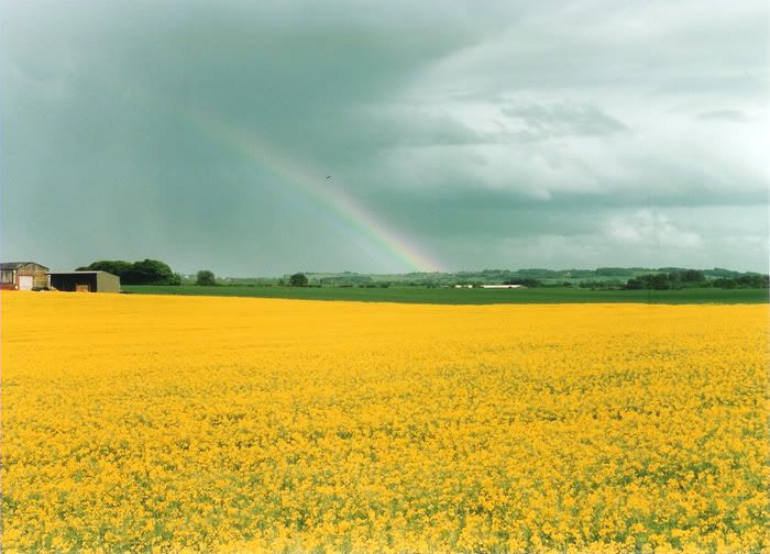
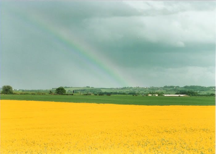
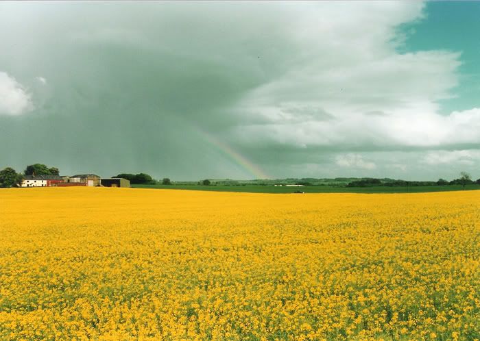
Which do you prefer? The brightest rainbow....  The double rainbow and solid block of yellow....  or, the dramatic clouds but smaller rainbow?  No cropping to any. Yashica 230AF Yashica 35-105 3.5/4.5 Fuji Superia 200 Regards - John |
|
|
|
Post by herron on Jun 5, 2006 16:40:38 GMT -5
Personally, John, I like the third one. The hint if clearing sky on the right seems to make the clouds more prominent, and it also serves to balance with the additional buildings on the left. All in all, IMHO, it is enough to add a nice perspective to the shot.  |
|
|
|
Post by Randy on Jun 5, 2006 18:38:26 GMT -5
I like the last one too John, did ya find a pot o' gold at the end?  |
|
|
|
Post by Just Plain Curt on Jun 5, 2006 23:21:12 GMT -5
I'm a sucker for dramatic cloud shots so I'll add my vote for picture #3. Nicely done John.
|
|
mickeyobe
Lifetime Member
   Resident President
Posts: 7,280
|
Post by mickeyobe on Jun 6, 2006 8:33:28 GMT -5
Me too.
The cloud formation adds something in No. 3.
Mickey
|
|
|
|
Post by Journalist on Jun 7, 2006 6:04:10 GMT -5
I like the composition and simplicity in the no.2 picture, no disturbing elements, besides of the white roof? on the right, that can be adjusted in Photoshop, some dodging perhaps? Then again I like the colors and depth of field better in no.3, but the farmbuildings disturbs the peace and quiet in the picture. If the farm was placed in the picture by the rule of thirds it would make a smoother part of the composition. The sky is much more dramatic in no.3 and makes the picture more lively and interesting. So my "verdict"  is take the no.3 sky and depth of field and combine with no. 2 composition and simplicity and it will be a classic open-field landscape. But that requires a whole lot of photoshopping  so my vote goes for no.3. Since these pictures are posted under Critique, I might sound more negative than I actually am. A slight twist of the camera to the left and up and the no.3 picture is a really nice landscape  |
|
|
|
Post by nikonbob on Jun 21, 2006 19:52:06 GMT -5
I would go for the third one. It has the right combo of elements for me. That is the rapeseed is not a solid block of yellow. the sky is dramatic and the rainbow can be seen nicely. I started out using a Yashica 230 AF, pretty darn good camera eh. Still got it too.
Bob Hammond
|
|
|
|
Post by kamera on Jun 22, 2006 0:17:40 GMT -5
Have to add my kudos to the 3rd. shot also.
The various elements all seem to flow into each other here better. I really like clouds so that also leaned me toward the last two shots.
What bothered me in the 1st. was the partial showing of buildings on the left side, like they just kind of creeped into the scene on ya unknowingly.
Ron Head
Kalamazoo, MI
|
|