|
|
Post by John Parry on May 25, 2006 15:59:42 GMT -5
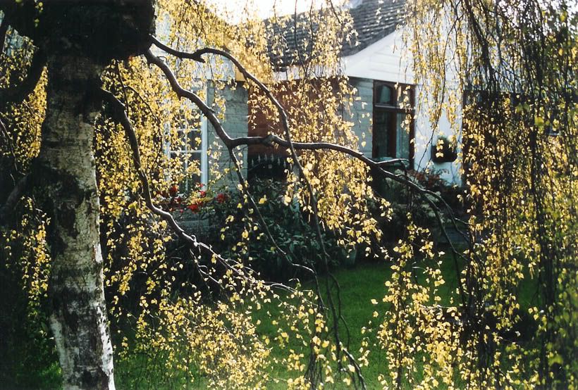
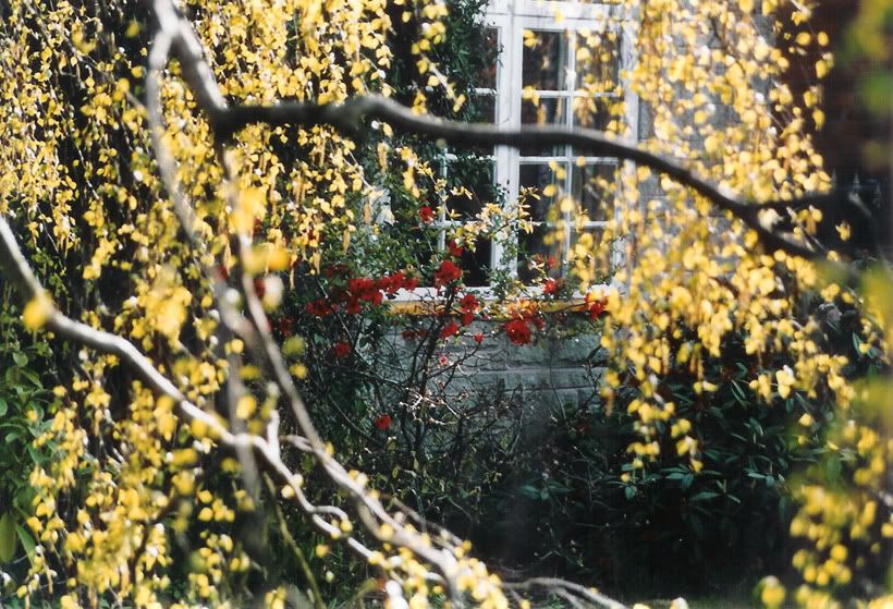
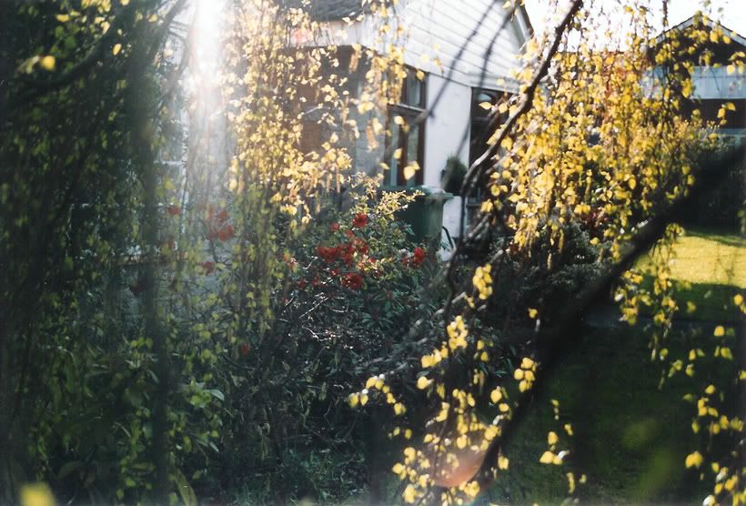
What's this photography lark all about? The first one shows the graceful shape of the birch  Second frames the quince bush nicely among the birch branches  And the third has got everything wrong.....  So why do I prefer the third??? What do you think? |
|
PeterW
Lifetime Member
   Member has Passed
Posts: 3,804
|
Post by PeterW on May 25, 2006 17:33:19 GMT -5
Can't see why you prefer the third, John. I like the second one the best. But I would like it more with a quite sizeable crop off the left hand side and a lesser crop off the top to give more eye direction towards the quince bush and emphasise it as the main subject.
Peter
|
|
|
|
Post by herron on May 25, 2006 21:12:52 GMT -5
The flare is interesting, John, but I agree with Peter...the second one is a stronger shot. I even agree with his crop advice...at least about the left side. I think it looks quite nice in a square cropping, leaving the top crop alone!  But, that's what makes horse racing....a difference of opinion!  |
|
PeterW
Lifetime Member
   Member has Passed
Posts: 3,804
|
Post by PeterW on May 26, 2006 16:42:56 GMT -5
Oy, Ron. Whaddayamean you EVEN agree. We don't often disagree ..... do we??   Keep smiling, Peter |
|
|
|
Post by John Parry on May 27, 2006 14:21:23 GMT -5
Mmmmm
OK, so we don't like number one! And I agree that number two could lose a little on the left and maybe the top too (although I suspect not as much as you would like Peter, my scene is of both the birch and the quince).
I still find the third intriguing though. I like the flare, as it's not strong enough to wipe out that section of the scene, and adds another focus of interest.
What I would really like to know though is how I got that blob of golden syrup running down the lens at the bottom. LOL
Regards - John
|
|