|
|
Post by nikonbob on Jun 30, 2010 13:39:00 GMT -5
Just thought these might be decent in B&W. Any C&C welcome. First two cropped for 8x10 last is full frame. Bob 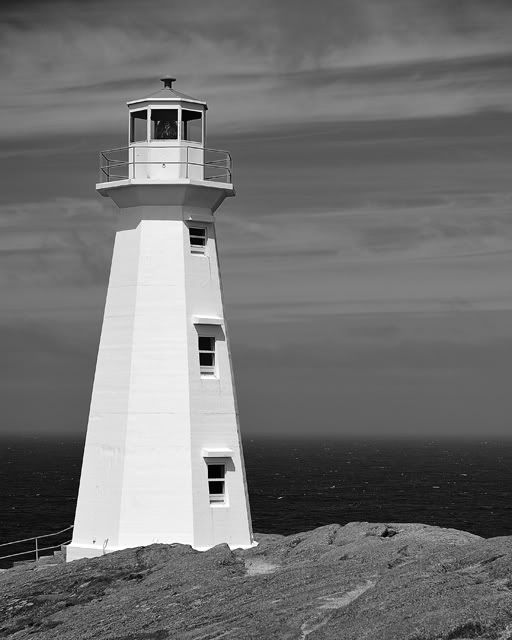 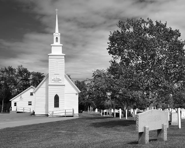 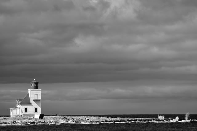 |
|
|
|
Post by John Parry on Jun 30, 2010 15:20:07 GMT -5
You're right Bob - they worked really well. I 'specially like the first.
Regards - John
|
|
|
|
Post by herron on Jun 30, 2010 16:10:43 GMT -5
Those look great! I vote for the third one!  |
|
PeterW
Lifetime Member
 Member has Passed
Posts: 3,804
|
Post by PeterW on Jun 30, 2010 17:16:08 GMT -5
These subjects are really well suited to lack and white, Bob. My favourite is the first. You ask for C&C. I like the second a lot, but feel just a slight increase in mid-tone contrast to give the full tone range from white to black might improve it just a little. With the third I wanted to be a litle more drastic. To me there is too much sky, so I would crop quite a bit off the top even though I like the layered clouds. Then I would crop a little off the right hand side to restore the overall balance. I also think it needs a spot of local increase in mid-tone contrast along the rocks. I took the liberty of copying your picture and doing this. I think it helps to focus interest on the lighthouse and the rocks.  If you think I've buggered it up, please say so. Tonal range and cropping are very subjective personal things. PeterW |
|
|
|
Post by nikonbob on Jun 30, 2010 19:24:11 GMT -5
Thanks for the C&Cs guys. Yea, it was the first one that got me thinking of trying some more B&W conversions. No, Peter, you haven't buggered a thing up at all. Your version looks good to me, and I see what you mean. I don't do much B&W so I am always ready to learn from someone, like you, who knows B&W very well. I don't think I'll ever master the program I am using but it sure is fun experimenting. Bonus is that it is a lot less costly with digital to experiment but I still feel like I am cheating somehow.
Bob
|
|